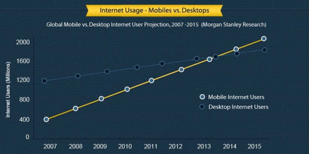
The fastest growing audience on the web are those using smartphones and tablets. So how well is your website engaging with visitors on mobile devices?
An increasing number of websites these days are also providing a specially designed version for smartphones and tablets aimed at improving usability for what is a distinctly different experience.
Why is reaching the mobile web important?

Research indicates that from 2013 onward, more people will use mobile phones than desktop computers to get online. What’s more, people using mobile devices are more likely to be distracted and on the move so they won’t have time for slow or hard to use websites. This means that going forward the website experience on a mobile device will be just as important if not more than the website experience on a desktop computer.
A website that has only been designed for desktop computers is likely to fall into the ‘slow or hard to use’ category when used on a mobile device. This is because there are a number of common issues for websites that aren’t mobile ready when used on a mobile device.
What are the common issues for websites that aren’t mobile ready?
- Content such as animations, interactive media and videos were commonly built in Flash which doesn’t work on iPhones & iPads
- Having lots of content or large file sizes for content such as images can take much longer to load over a mobile network so page load times become too slow
- Text size on a mobile phone screen can appear too small to easily read
- Pages are too wide to easily view all the content at once on a mobile phone screen so require lots of side to side scrolling or zooming in and out
- Links and buttons displayed on a mobile device can be too hard to tap with a thumb
- Functionality that requires hovering the mouse on a desktop, eg. drop down menus and tooltips, don’t work on mobile touch screens
These issues all lead to visitors getting frustrated and abandoning the site before they find what they are looking for or complete their purchase. However with the right kind of mobile strategy in place all of these issues can be addressed allowing a greater engagement with your mobile audience.
An Overview Of Mobile Strategy Options
When it comes to a mobile strategy there are plenty of options but essentially there are two main approaches. Namely, mobile websites and native apps for smartphones. Each approach has different strengths and understanding the differences can help clarify the mobile strategy that best suits your audience. Here is a basic breakdown of the strengths for each approach:
- Mobile sites are more accessible from a greater range of devices
- Mobile sites can be built and updated quicker and can be more cost effective to develop and maintain
- Native apps eg. an iPhone app or an Android app, can be better designed to suit the specific platform and provide faster and easier access
- Native apps are better suited for frequent and regular usage as they occupy space on the persons smartphone
- For one-off or infrequent use a person will be less likely to go to the trouble of finding and installing an app just to find out more information on a product or service
You may find that some people see it as a ‘one or the other’ decision and they may even go so far as to tell you which. But in today’s environment a combination of both solutions is becoming a common approach to get the best of both.
Piecing It All Together
Working out your own mobile strategy and moving ahead with it will take an investment of time and is an ongoing process to review at different stages as you progress. But here is some initial steps that can help you to start piecing it all together:
- Frequently using your website from different mobile phones and tablets will quickly help you identify what the issues are with your existing website
- Set some short, medium and long term goals to reaching the mobile web better. You may need to engage someone experienced in this area to help. A short term goal might be to set up a basic mobile landing page with some brief info and contact details. A medium term goal could be to develop a separate mobile site or to re-develop your existing website to have a responsive design which automatically scales and displays content that best suits the device or desktop being used, and a long term goal might be to also develop a native app for iPhone & Android that provides faster and easier access to frequently used features and information. Having the right goals up front to correctly suit the purpose and budget is just as important as getting into the designing and developing of the proposed solution. If you start with the wrong goals you could easily end up over or under investing in your mobile strategy or be made to feel that moving ahead with a mobile strategy will have to wait until a bigger budget is available
- Invest in designing a quality mobile experience and not just some mobile experience. If it’s done badly it could have a worse effect on your audience than having no mobile experience at all. User experience design plays a key role in delivering a quality experience across all mobile devices and desktops

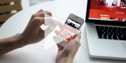
The video to the left is a short promo produced by Matobo Films that shows some behind the scenes insights into the BBC user experience design process for their TV website and iPlayer video broadcasting platform. In this video you can see some of the design considerations that were made for each of the different mobile devices and desktops. Also because it’s a high profile and large scale project you can clearly see the importance of user experience design and how much work went into producing a quality experience right across the board.